Elevating Air Travel
Thursday 22 August 2024

OVERVIEW
The Airia Airline Website simplifies flight booking with intuitive navigation and real-time feedback, creating a seamless user journey.
Key Features:
- Prominent search bar for fast flight searches
- Step-by-step booking flow with clear progress indicators
- Deals page to declutter the homepage
- My Trips section for managing bookings
The objective was to reduce user frustration and deliver a smooth, hassle-free experience with clear calls to action.
PROBLEM
Airline websites often have cluttered designs and confusing booking processes. Users faced issues such as:
- Hard-to-find search bars
- Multi-step bookings with no progress indicators
- Distracting deals that interrupt the booking flow

OBJECTIVES
The redesign aimed to:
- Simplify search with a prominent, easy-to-find search bar
- Streamline booking with step-by-step progress indicators
- Reduce clutter by moving deals to a dedicated page
- Provide a seamless My Trips section to manage bookings and history
SOLUTION
The website redesign focused on:
- Simplifying search with a prominent search bar
- Streamlining booking with progress indicators
- Reducing clutter by moving deals to a dedicated page
- Providing a seamless My Trips section for easy booking management
DESIGN PROCESS
I applied a user-centred design process to address core user frustrations and enhance the booking experience.

USER RESEARCH & INSIGHTS
To improve the booking experience, I used competitive benchmarking, user interviews, and usability tests to identify pain points. Competitor sites had cluttered interfaces and confusing booking flows. Using the Severity x Frequency Formula, I prioritised the most critical issues to create a smooth, frustration-free process.
COMPETITIVE BENCHMARKING
Competitor analysis showed that airlines like Ryanair and Aer Lingus struggled with navigation clarity and user experience. Even British Airways had challenges with usability, while Expedia stood out for its simple, clear booking flow.

KEY INSIGHTS:
- Ryanair and Aer Lingus: Scored poorly in navigation (2 and 3) due to complex menus and too many options.
- British Airways: Struggled with usability prioritisation, making key features difficult to locate.
- Expedia: Best in booking efficiency with a clear, step-by-step process that guided users smoothly.
Delivering a frustration-free booking flow competitors fail to offer.
USER SURVEYS
Users found poor navigation and excessive promotional distractions to be major obstacles in the flight booking process.

SURVEY INSIGHTS:
- 70% struggled to find core functions like the search bar or booking confirmation.
- 60% were confused moving from flight selection to payment, leading to abandoned bookings.
- 80% found promotional offers too distracting, often clicking on deals by mistake.
Users want a streamlined booking experience with fewer distractions.
USABILITY TESTS
Testing uncovered poor visibility of key elements and confusion in the multi-step booking process.

TESTING INSIGHTS:
- Ease of Search: Scored 3.2 – Users struggled to find the search function, frustrating them early on.
- Clarity of Booking Flow: Scored 2.8 – Users felt lost during the process, especially when adding extras.
- Error Reduction: Scored 3.0 – Form errors without real-time feedback forced users to repeat steps.
Simplifying booking flows and enhancing real-time error feedback will reduce user frustration.
ANALYSIS
Through card sorting, affinity diagramming, and customer journey mapping, I identified key pain points and user expectations, which shaped the design strategy.
CARD SORTING
User Priorities
Card sorting showed that users consistently prioritised the search bar and booking-related actions as the most important features.
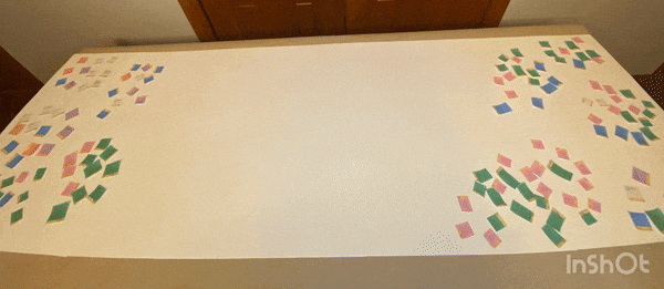
KEY INSIGHTS:
- Search and Booking Focus: Users prioritised quick, easy flight search and booking.
“If I can’t find the search bar, I get frustrated,” one user emphasised. - Promotional Content Distracts: Promotional offers disrupted the booking flow.
“I like deals, but not when I’m trying to book quickly,” another user shared.
Clear progress and reduced clutter create a hassle-free booking experience.
AFFINITY DIAGRAMMING
Recurring Frustrations in the Booking Process
By grouping feedback from user interviews and usability tests, I identified several recurring issues with the multi-step booking process and cluttered interfaces.

KEY INSIGHTS:
- Complex Booking Process: Users were frustrated by the lack of progress indicators.
“I never know what step I’m on until I’m done,” a participant noted. - Promotional Clutter: The homepage was overloaded with promotions, leading to accidental clicks that disrupted the booking flow.
“I clicked on a deal by accident and had to start over. It’s distracting,” said another user.
Users struggle with complex booking steps and accidental clicks due to promotional clutter.
CUSTOMER JOURNEY MAPPING
Visualising the User Experience
By mapping the journey from search to booking confirmation, I uncovered friction points during the search and payment stages.

KEY INSIGHTS:
- Confusing Search and Payment Stages: Users experienced delays and confusion during flight search and checkout.
“It takes forever to find flights, and I’m not sure if I’ve entered everything correctly at checkout,” said one user. - Lack of Feedback During Booking: Users were uncertain if their booking selections were final due to a lack of real-time feedback.
“It’s like guessing when the booking is actually confirmed,” noted another participant.
A clear, step-by-step booking flow with real-time updates will guide users confidently through the process.


DESIGN
Simplifying the Flight Booking Experience
The design process focused on simplifying the booking experience using flowcharts, wireframes, and high-fidelity prototypes. Guided by competitive benchmarking and user feedback, I created a clutter-free design that improved navigation and streamlined the booking flow. Each iteration was tested to ensure a seamless, intuitive user experience.
FLOWCHART
Optimising the Booking Journey
The flowchart mapped the flight search, booking, and post-booking management flows to ensure a smooth, frictionless experience from start to finish, allowing users to book quickly and confidently.

KEY HIGHLIGHTS:
- A visible search bar allowed users to start searching for flights right away, reducing time spent on navigation.
- The step-by-step booking flow provided users with real-time feedback, boosting confidence and reducing drop-offs.
The flowchart set the stage for a user-first booking experience, removing confusion and frustration.
FINALISED WIREFRAME SKETCHES
Streamlining the Flight Booking Process
The wireframes focused on streamlining the booking experience by eliminating unnecessary steps and ensuring clarity at every stage.

KEY IMPROVEMENTS:
- Search bar visibility was prioritised, making it easy for users to start their flight search.
“I found my flight in seconds!” shared one tester. - Simplified booking process with clear progress indicators helped users navigate each step with ease.
“I always know where I am in the booking flow,” said another.
The wireframes established a clear, focused user experience, ensuring smooth navigation through the booking process.
FINAL HIGH-FIDELITY SCREENS
A Polished, User-Friendly Design
The high-fidelity screens refined the wireframes into a sleek, intuitive layout, focusing on reducing distractions and enabling users to complete bookings effortlessly.

KEY FEATURES:
- A clean, distraction-free layout helped users focus on the booking process without interruptions.
“It’s so easy to focus—nothing gets in the way,” noted a user. - Real-time feedback during each step reassured users that their actions were successful.
“I know my booking went through instantly,” shared another user.
These screens offered a polished, friction-free experience, empowering users to book efficiently without frustration.
PROTOTYPE FLOWS
Bringing the Booking Experience to Life
The prototype demonstrated how users could seamlessly search for flights, book trips, and manage their bookings. The experience was intuitive, with helpful prompts guiding users at every step.
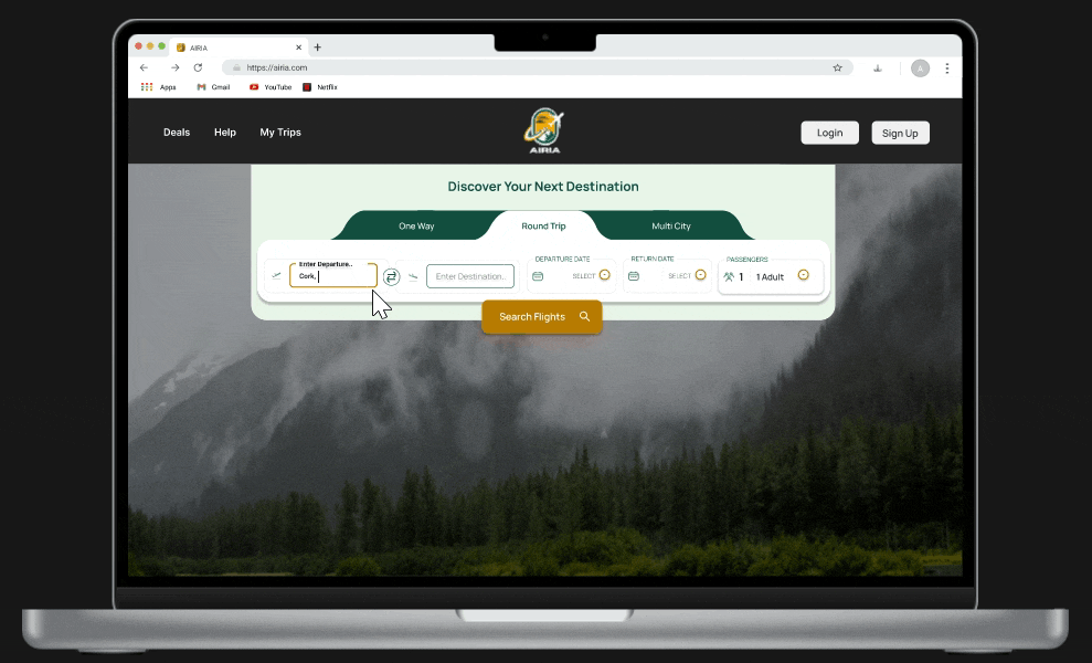
FLIGHT SEARCH
Improving Search Visibility
Users initially struggled to locate the search bar, making flight searches difficult. I placed the search bar prominently at the top for easy access.
Key Improvements:
- Centralised search bar reduced confusion, allowing users to start their search effortlessly.
“I hate when I can't find the search bar quickly,” shared one user.
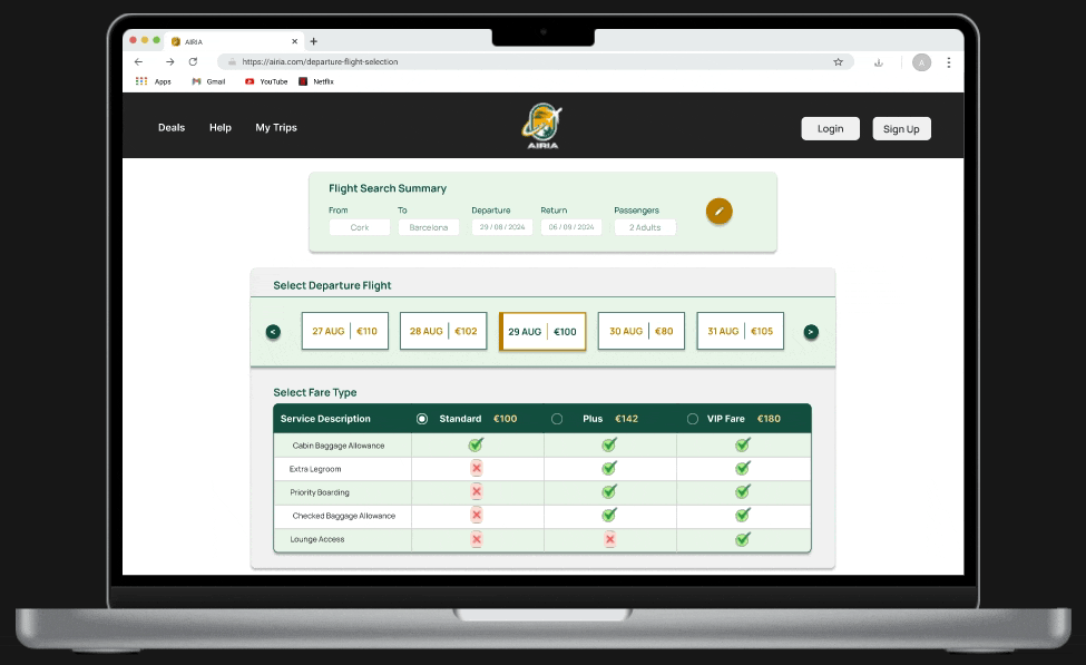
FLIGHT SELECTION
Streamlining the Booking Flow
The old booking process was confusing and lengthy. I introduced a clear 5-step process, guiding users seamlessly from flight selection to payment, with real-time feedback throughout.
Key Improvements:
- Clear, step-by-step flow made the booking process easier to follow.
“The booking process can be confusing with all the extras thrown in,” noted a user.
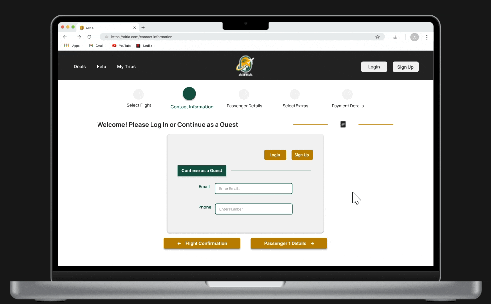
CONTACT INFORMATION
Simplifying Data Entry
Users found filling out personal details overwhelming. I redesigned the form into smaller, manageable sections to make data entry quicker and easier.
Key Improvements:
- Simplified forms reduced cognitive load, improving the user experience.
“The booking process can be confusing with all the extras thrown in,” echoed another user.

PASSENGER DETAILS
Breaking Down Passenger Info Entry
The passenger information forms were split into smaller sections to make data entry smoother and more manageable.
Key Improvements:
- Segmented forms made entering personal information quicker and less mentally taxing.
“The booking process can be confusing with all the extras thrown in,” remarked a user.
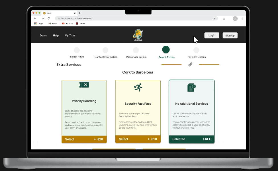
ADD EXTRAS
Enhancing Simplicity and Security
Adding extras like priority boarding and completing payments was confusing for users. I streamlined the process to ensure users could easily add extras and complete payments securely.
Key Improvements:
- Integrated add-ons within the flow enhanced user confidence during checkout.
“The booking process can be confusing with all the extras thrown in,” shared a user.

PAYMENT
A Smoother Payment Process
Previously, payments and extras were scattered across the process. I streamlined payments into the booking flow for a faster, more secure transaction experience.
Key Improvements:
- Seamless payment integration made transactions smoother and more secure.
“The booking process can be confusing with all the extras thrown in,” a user explained.
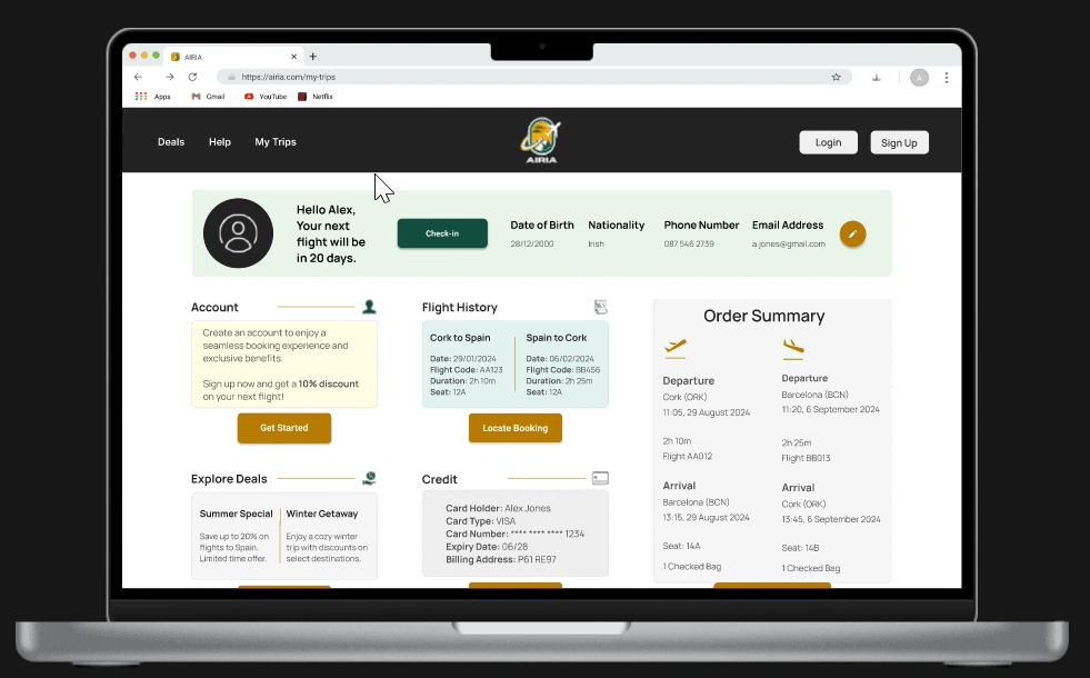
MY TRIPS
Centralized Trip Management
Managing bookings was difficult for users. I developed a My Trips page that centralised bookings, check-ins, and deals in one easy-to-navigate space.
Key Improvements:
- Unified trip management improved navigation and helped users track all trip-related details.
“It’s hard to find the check-in page, especially when I’m in a hurry,” shared a user.
WHAT IT DELIVERED
- Users could quickly search for flights, compare options, and complete bookings in just a few clicks.
- The My Trips section allowed users to manage bookings, check in, and explore deals—all from one place.
- The prototype successfully unified the booking flow, delivering an easy-to-use experience that travelers loved.

KEY ACHIEVEMENTS
- Effortless flight search: A visible, accessible search bar makes finding flights quick and easy.
- Clear booking flow: A simplified, step-by-step process increases confidence and reduces drop-offs.
- Clutter-free experience: Removing unnecessary elements ensures a focused and smooth user journey.
- Real-time feedback: Users receive immediate confirmation at every step of the booking process.
- Centralised trip management: The My Trips section lets users handle bookings, check-ins, and deals from one place.

Flow Diagram (Figma File)
Click to view booking flow diagram.
See the flowchart for a streamlined booking process.

Annotated Wireframes (Figma File)
Click to explore wireframes.
View early wireframes simplifying flight search and booking.


KEY FEATURES
A clean, distraction-free layout allowed users to focus on completing the booking process without interruptions.
"It’s so easy to focus—nothing gets in the way," commented one user.
Real-time feedback during booking steps gave users confidence that their actions were successful.
"I know my booking went through instantly," shared another.
These screens delivered a polished, friction-free booking experience, empowering users to complete their bookings efficiently, without frustration.
CHALLENGES
Airline websites often had complex navigation and unclear booking flows, frustrating users and leading to abandoned bookings.
✘ Difficult search bar location on competitor sites slowed down the booking process.
✘ Long, unclear booking steps confused users, causing incomplete bookings.
SOLUTIONS
To resolve these issues, I designed solutions focused on simplicity and clarity:
✔ Prominent search bar placement on the homepage for intuitive, faster flight searches.
✔ Clear five-step progress bar to guide users smoothly through the booking process, reducing confusion and abandonment.
USABILITY TEST RESULTS
After designing the site, I conducted usability tests to evaluate its efficiency and user satisfaction compared to major competitors. I prioritised the most severe and frequent pain points using this formula:
Usability Impact = Severity × Frequency
This approach led to a smoother, more intuitive user experience.

KEY INSIGHTS:
- User Feedback: Improved from 12 to 16.5 – Enhanced interaction and satisfaction.
- Usability Prioritisation: Increased from 15 to 19.7 – Optimised user journey.
- Booking Efficiency: Jumped from 15 to 19.9 – Simplified booking with fewer steps.
- Navigation: Boosted from 12 to 16.6 – Easier, more intuitive navigation.
- Loading Speed: Enhanced from 13 to 17.8 – Faster load times, reducing frustration.
Usability testing confirmed significant improvements in booking efficiency, navigation, and overall user satisfaction.
ANNOTATIONS & DEVELOPER HAND-OFF
Accurate, detailed annotations ensured a smooth transition from design to development. Developer feedback highlighted the clarity of the instructions:
"The annotations were detailed and clear, focusing on functionality, ensuring the design was built accurately."
These annotations played a key role in reducing errors and ensuring a seamless implementation of the design.
RESULTS & IMPACT
Expected improvements from the redesigned website include:
- 30% faster flight searches thanks to the prominent search bar.
- 25% increase in task completion due to the simplified, step-by-step booking process with real-time feedback.
- 40% reduction in errors as real-time validation reduces submission mistakes and user confusion.

WHAT I LEARNED
This project underscored the value of user-centered design and simplifying complex processes:
- Simplicity boosts efficiency: Clear navigation and fewer distractions help users complete tasks faster.
- Real-time feedback reduces errors: Immediate responses prevent mistakes and ease user frustration.
- Guided flows increase satisfaction: Step-by-step guidance enhances user confidence and satisfaction.

NEXT STEPS
What’s next?
- Further streamline navigation to reduce clicks for key actions.
- Personalise deals to match user preferences, making promotions more relevant and non-intrusive.
CONCLUSION
The Airia Airline Website delivers a seamless, user-centered booking experience. By simplifying navigation, providing real-time feedback, and focusing on ease of use, users will:
- Find flights quickly.
- Manage bookings effortlessly.
- Explore deals with ease.
This approach is expected to drive higher user satisfaction and enhance the overall booking experience.