Streamlining Engineering
Wednesday 2 October 2024
OVERVIEW
The Engineering Report App makes report creation and management effortless for engineers, focusing on efficiency and accuracy through automation.
Key Features:
- Automated report generation for faster output
- Image capture for exception reporting
- Client management tools
- Real-time metrics for better insights
The app’s goal was to reduce reporting time, improve accuracy, and offer a user-friendly experience with intuitive navigation.
PROBLEM
Engineers struggled with inefficient, manual report generation, facing challenges like:
- Difficulty integrating images into reports
- Challenges managing client reports
- Lack of real-time performance tracking
OBJECTIVES
The app aimed to:
- Automate reporting to save time and effort
- Enable image capture for seamless visual data integration
- Provide real-time performance tracking to enhance efficiency
SOLUTION
The app solves key challenges by offering:
- Automated report generation for efficiency
- Integrated image capture for more complete reports
- Client management tools to track historical reports
- Metrics dashboards for immediate insights

DESIGN PROCESS
I followed a user-centred design approach, ensuring the app met the needs of engineers at every step.

USER RESEARCH & INSIGHTS
My research uncovered inefficiencies in engineers' reporting workflows through competitive benchmarking, user interviews, and usability tests. Key gaps in automation and manual processes were identified. Using the Usability Impact Formula, I prioritised features that would maximise automation and efficiency in the design solution.
COMPETITIVE BENCHMARKING
I analysed tools like PDFGen Pro, Smallpdf, Adobe Acrobat, and PDF-XChange Editor.
While each had strengths, none offered a fully integrated solution to replace manual, paper-based workflows for engineering report management.

KEY INSIGHTS:
- PDFescape: Scored lowest in automation and exception reporting (2 and 3), leaving users dependent on manual processes.
- Adobe Acrobat: Strong in automation and image capture (5), but limited metrics navigation (4) made accessing data harder.
- PDF-XChange Editor: Balanced automation and customisation (4 each), but lacked advanced metrics navigation.
The only app to fully integrate automation, customisation, and metrics navigation for seamless reporting.
USER SURVEYS
Engineers expressed frustration with the slow, error-prone manual process, particularly in data entry, image attachment, and navigation.

SURVEY INSIGHTS:
- 50% said manual processes were too slow and error-prone.
- 70% struggled with image capture for exception reports.
- 60% found metrics navigation too complex for efficient performance tracking.
Surveys show a clear need for automation, visual data capture, and simpler metrics to reduce errors.
USABILITY TESTING
Tests revealed challenges in speed, accuracy, and workflow clarity in the manual process.

TESTING INSIGHTS:
- Automation: Scored 3.0, indicating a need to automate repetitive tasks.
- Report Speed: Scored 2.5, as manual report generation was too slow.
- Error Reduction: Scored 2.8, with frequent data entry mistakes.
- UI Clarity: Rated 3.2, as the system was not intuitive and caused confusion.
An automated solution will improve efficiency, reduce errors, and streamline workflows.
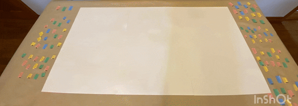
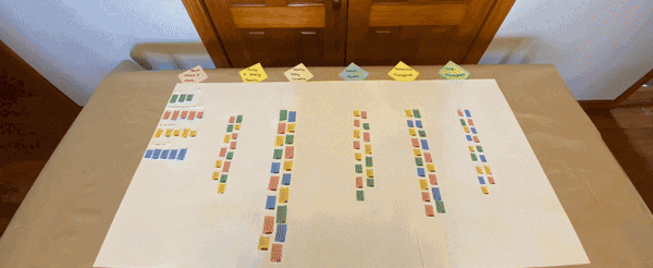
ANALYSIS
I used card sorting, affinity diagramming, and customer journey mapping to identify inefficiencies and opportunities for automation. This revealed where automation would have the greatest impact, guiding the design toward improved efficiency and usability.
CARD SORTING
Key Pain Points
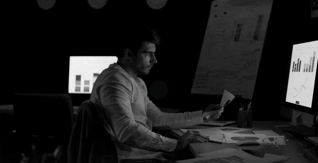
Engineers expressed frustration with manual reporting, particularly the delays caused by handwriting reports at the end of long shifts.
KEY INSIGHTS:
- Manual Reporting Burden: Engineers felt overwhelmed by the time spent handwriting reports.
“After a long day, the last thing I want is to handwrite reports,” said one participant. - Environmental & Security Concerns: Engineers saw paper as inefficient, unsustainable, and insecure.
“Storing paper reports doesn’t feel secure,” another participant noted.
Switching to digital reporting eases the workload, enhances security, and is eco-friendly.
AFFINITY DIAGRAMMING
Common Themes from User Interviews
Affinity diagramming revealed the recurring challenges engineers faced with managing paper-based files, especially when retrieving old reports.
KEY INSIGHTS:
- Inefficient Report Retrieval: Engineers struggled to find old reports in physical files.
“If I need an old report, it can take ages to find it,” one engineer shared. - Document Vulnerability: Storing sensitive client information on paper raised concerns about security and damage.
“Paper reports can get lost or damaged. It doesn’t feel secure for sensitive data,” said another.
Engineers face delays in retrieving old reports and worry about the security of paper documents.
CUSTOMER JOURNEY MAPPING
Pain Points in the Reporting Process
Mapping the reporting journey revealed issues with feedback and exception reporting, leaving engineers uncertain about successful submissions.

KEY INSIGHTS:
- Lack of Submission Confirmation: Engineers often had to follow up to confirm report delivery.
“I sometimes call the office just to confirm it’s been sent,” shared one engineer. - Challenges in Exception Reporting: Manually documenting anomalies was time-consuming and difficult after long shifts.
“It’s tricky describing what went wrong after a long day,” noted another.
Real-time tracking and notifications will give engineers immediate submission feedback and streamline exception reporting.


DESIGN
Automating Workflows and Enhancing the User Experience
The design phase focused on automating workflows and improving the user experience through flowcharts, wireframes, and prototypes. Insights from competitive analysis and user interviews guided the integration of features like image capture and metrics dashboards. Prototypes were continuously tested and refined to ensure efficiency and automation goals were met.
FLOWCHART
Mapping the User Journey
The flowchart outlined key user flows for report creation, client management, and performance tracking, ensuring a streamlined, efficient workflow that minimised manual tasks for engineers.

KEY HIGHLIGHTS:
- Simplified report workflows reduced manual steps, allowing engineers to focus on essential tasks.
- Real-time feedback ensured engineers knew when their reports were successfully logged, building confidence in the system.
The flowchart provided a clear, user-centric blueprint, streamlining app development.
FINALISED WIREFRAME SKETCHES
Building an Efficient Reporting System
The wireframes laid the groundwork for a faster, digital alternative to handwritten reports, focusing on reducing user friction and boosting efficiency for engineers.

KEY IMPROVEMENTS:
- Automated report generation reduced manual input, allowing engineers to submit reports in just a few clicks.
“It saves me so much time after a long day,” noted one user. - Quick client access enabled engineers to easily manage and retrieve reports.
“I can pull up any report in seconds now,” shared another.
The wireframes established a clear, focused user experience, ensuring smooth navigation through the booking process.
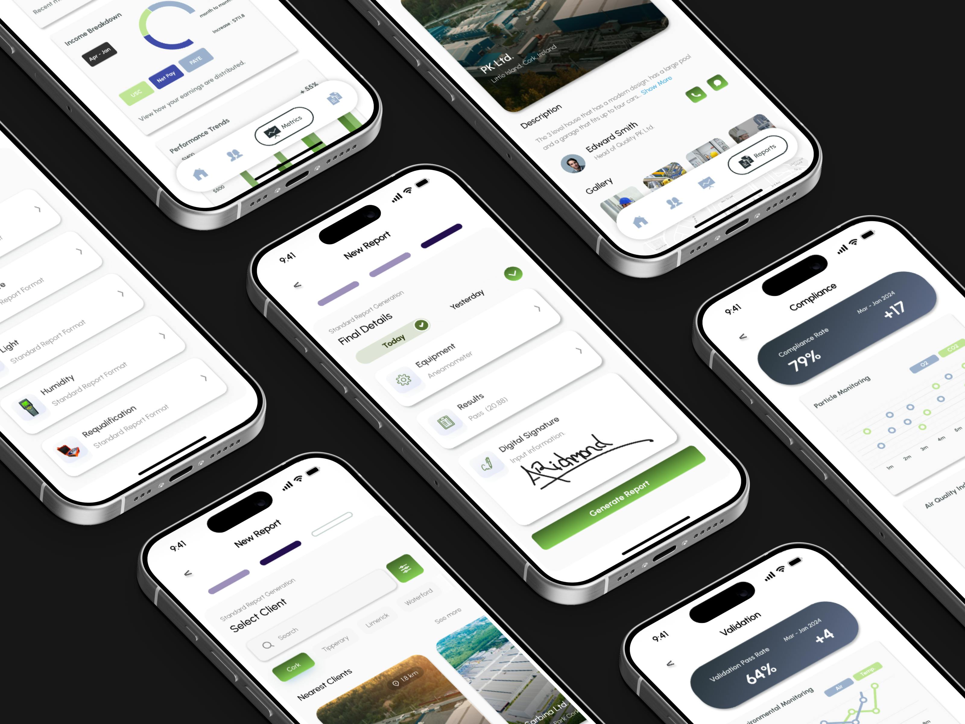
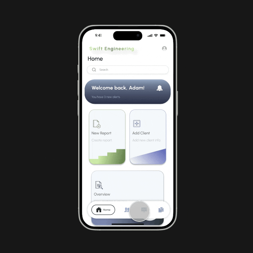
FINAL HIGH-FIDELITY SCREENS
Creating a Seamless Experience
The high-fidelity screens turned wireframes into a polished, intuitive design, allowing engineers to complete reports quickly and access essential data with ease.

KEY FEATURES:
- A bottom navigation bar gave engineers immediate access to core functions like reports and client management.
- Real-time feedback reassured engineers that their reports were submitted successfully, increasing confidence in the process.
These screens provided a clean, efficient experience, allowing engineers to complete tasks with minimal interruptions.
PROTOTYPE FLOWS
Turning Ideas Into Action
The final prototype enabled engineers to quickly create reports, manage clients, and access performance metrics with just a few clicks. The system was designed to maximise speed and efficiency, minimising time spent on repetitive tasks.
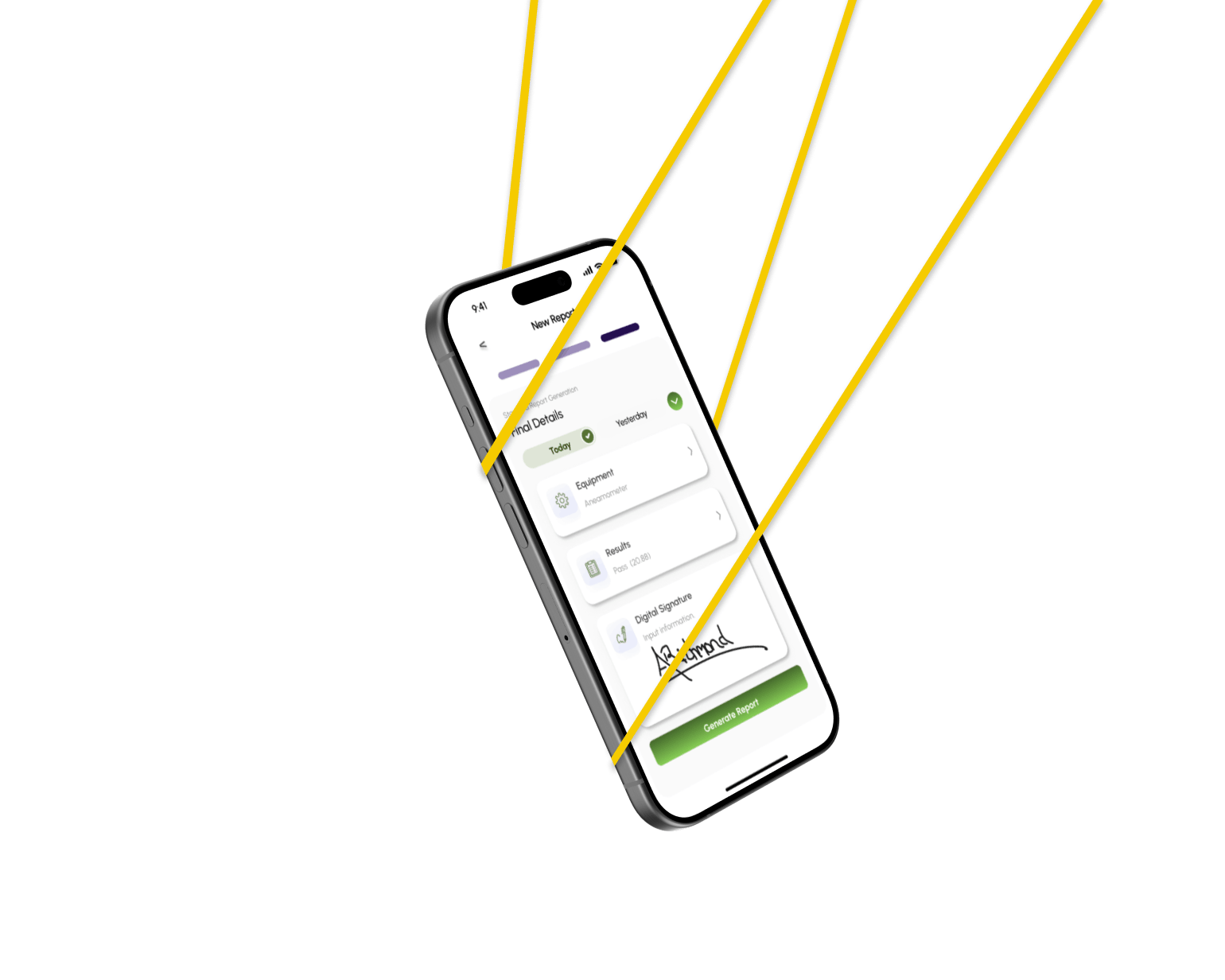
CREATING A REPORT
Streamlining Report Creation
The report creation process was time-consuming and inefficient. I simplified it into three steps, significantly reducing the engineers' workload.
Key Improvements:
- Automated steps allow engineers to quickly choose a report type, input details, and submit with ease.
“After a long day, having to handwrite reports feels like extra work I don’t have energy for,” shared one engineer.


EXCEPTION REPORTING
Simplifying Exception Documentation
The original exception reporting process was manual and inefficient. The new flow integrates quick image capture, making documentation faster and more accurate.
Key Improvements:
- Integrated image capture lets engineers upload photos directly within the report flow.
“It’s tricky trying to describe what went wrong, especially after a long day,” noted an engineer.
CLIENT MANAGEMENT
Efficient Client Data Management
Managing client data was fragmented and hard to track. The new interface allows engineers to search, view, and update client information seamlessly.
Key Improvements:
- Unified data management streamlines access and updates to client records.
“It’s frustrating trying to find an old report in a pile of papers,” commented an engineer.

VIEWING METRICS
Delivering Real-Time Insights
Engineers struggled to access metrics quickly. The new dashboard now provides real-time performance data for faster, more informed decisions.
Key Improvements:
- Clear data visualisations allow engineers to see metrics at a glance.
“If I need an old report, it can take ages to find it,” said one user before the redesign.
WHAT IT DELIVERED
- Engineers could complete reports in minutes, attach images on-site, and log issues instantly.
- Managers gained real-time access to performance data, enabling better decision-making and faster issue resolution.
- This prototype transformed the reporting workflow, delivering tangible value and improving overall efficiency.
KEY ACHIEVEMENTS
- Automated reporting: Engineers now complete reports with just a few clicks, saving valuable time.
- Simplified client data access: Client information is easier to find and manage, boosting efficiency.
- Instant submission confirmation: Engineers receive real-time feedback, reducing errors and improving confidence.
- Streamlined workflows: Clear, intuitive processes cut down on manual tasks and speed up reporting.
- Data-driven insights: Managers can easily track and compare performance metrics via a user-friendly dashboard.
Check out the designs that brought it all together.

Flow Diagram (FigJam File)
Click to view the workflow diagram.
Explore the user flows for creating reports, managing clients, and accessing metrics.

Annotated Wireframes (FigJam File)
Click to explore wireframes.
See early wireframe sketches for a more efficient reporting interface.


CHALLENGES
Engineers faced multiple pain points during the manual process, leading to inefficiencies:
✘ Cumbersome image capture in the field for exception reports.
✘ Difficult, time-consuming access to historical reports during client management.
SOLUTIONS
To resolve these issues, I implemented solutions aimed at improving efficiency and ease of use:
✔ Instant camera access to streamline image capture in the field.
✔ Client history with search function to enable quick access to past reports.
USABILITY TEST RESULTS
Preliminary usability tests identified key pain points in the manual reporting process. The focus was on improving automation, reducing errors, and enhancing workflow efficiency. Prioritisation was guided by this formula:
Usability Impact = Severity × Frequency
This ensured the app addressed the most critical user needs.

KEY INSIGHTS:
- Exception Reporting: Expected improvement from 12 to 16.5 – Boosting efficiency in reporting anomalies.
- Automation: Anticipated jump from 16 to 21 – Reducing manual tasks with automated workflows.
- Image Capture: Set to improve from 15 to 20 – Smoother, faster image-based reporting.
- Metrics Navigation: Expected increase from 13 to 17.8 – Clearer access to performance data.
- Report Customisation: Planned improvement from 14 to 18.7 – Offering greater flexibility in report tailoring.
Enhanced automation and smoother workflows ensure the app meets engineers' most pressing needs.
ANNOTATIONS & DEVELOPER HAND-OFF
Clear, precise annotations were critical for an accurate developer hand-off, ensuring that every design feature was implemented smoothly.
"The language was clear, precise, and focused on functionality, ensuring smooth development with minimal ambiguity."
These detailed annotations ensured a smooth development process and minimised errors during implementation.
RESULTS & IMPACT
Anticipated outcomes of the new design include:
- 30% faster report creation through automation.
- 25% more efficient client data management.
- 40% error reduction due to real-time feedback and automated workflows.

WHAT I LEARNED
By focusing on automation and real-time feedback, I learned that simplifying workflows results in faster reporting and fewer errors. Streamlining manual steps reduces frustration and enhances efficiency.
This project reinforced the importance of clear guidance and automation in improving workflow efficiency.

NEXT STEPS
- Further optimise navigation to reduce clicks.
- Enhance image capture with faster uploads and auto-tagging for better context.
CONCLUSION
The Engineering Report Automation App transformed the manual, paper-based reporting process into a streamlined, efficient solution. By applying skills from my UX diploma, I enhanced the app’s usability, improving workflows, data accuracy, and reporting speed. This redesign ensures the app continues to meet the evolving needs of engineers.